Wednesday 30 April 2014

Evaluation Question 7 - Looking back at your preliminary task, what do you feel you have learnt in the progression from it to the full product?

In terms of comparing our two tasks, it is clear that both our editing and camerawork have hugely improved by the time we made our final task. This could be attributed to the fact that we had better equipment to work with (a HD camera as opposed to a camcorder). This said, the much more coherent product which was our final piece came because we were given time to practise our techniques in both filming and editing, and this is evident from looking at certain aspects of our two films.

The Planning Stage


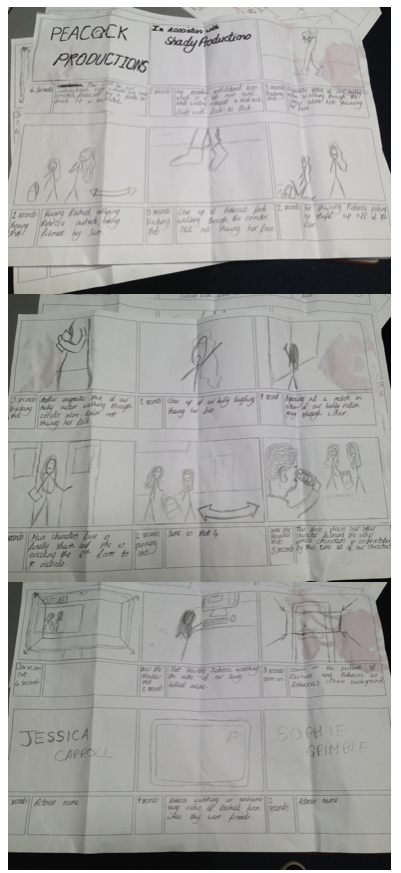
The difference in levels of detail between the storyboard
for the preliminary task (above) and the final task (below) is
one of the main reasons as to the huge difference in
 outcome between the two of them.
Most of the difference between the two tasks came from the huge amount of planning which I put into my final piece. This began with the analysis of several other film openings from a wide range of genres - this is what taught me what is included in a film opening, the order in which titles run, and gave me a rough idea of a suitable length for the opening. After this I spent time analysing film openings which other AS media students had made, in order to get an idea of the quality which my opening would have to be at. I did my own research into things such as the effect of certification, audience theories, and made questionnaires in order to find out what my
audience would want to see within a film opening. After this, the process of actually planning the film began - we planned it through producing three separate storyboards - an initial hand drawn one, a photographic one, and an animatic one. By planning this out, we knew the exact shots, with angles and movement included, so we were able to draw up a shot list to ensure that we filmed everything which needed filming. Additionally, this helped us to edit our film in to a much more cohesive product, because we knew exactly how each shot needed to go into the next, and how long each title would remain on the screen for.


In addition to this, we spent much more time filming, which resulted in us filming each individual clip three times. This meant that during the editing stage, we had much more footage to choose from, so that if one clip wasn't up to scratch, we could just replace it with another take of the same clip - it was a much more efficient way of managing time, because it meant that there was no need to do any reshooting. We wanted to make sure of this because reshooting was a big problem for the preliminary task, because it meant that different costumes are being worn at the beginning compared to the end of the clip.


Equipment 


Developing our iMovie skills allowed us too experiment with
the font and colour of our titles - this had not been available
to us when filming our preliminary task.
Not only did we have access to much better equipment for our final piece, but we developed our skills in order to make the product look as good as possible. This included using a much wider variety of camera angles, and perfecting the techniques which I have detailed below. In addition to this, we had access to a dolly for our final piece, which meant that we could film some really good tracking shots. The difference in camera quality between the two different pieces is clearly obvious - the preliminary task was filmed on a camcorder whereas the final piece was filmed on a proper HD camera, which means that there is a massive difference in quality. A final difference in the use of equipment was our development of iMovie skills - we were much more experienced with the more advanced features of the software by the time that it came round to editing the final piece. This was a big reason in the two products looking so vastly different to each other.

Match on Action

We included a match on action in our final piece in the same way that we included it in the preliminary - through the use of a door being opened. However, it looks much better in the final film, because we chose better angles to capture the shots from, had more time to film it, and had much more experience when we came to editing it. The most notable difference between the two different uses of match on action is the smoothness which is evident in the final film - this is because it doesn't contain a jump cut straight afterwards, which is what makes it look like more realistic continuity editing. 


Whilst the match on action in the preliminary was good, the
jump cut straight after it was very unrealistic.

This was completely different in our
final film, because the match on action
was fast and looked incredibly realistic -
it is a good example of continuous editing


180 Degree Rule 

I believe that we adhered to the 180 degree rule much better in our final piece than we did in our preliminary film. This is because during the bedroom shots, we ensured that the camera always stayed one side of the girl, to make sure that it didn't cross the imaginary line which would break the rule. This is a contrast to our preliminary task, because we moved the camera about too many times in order to stick to the rule whilst filming it - this means that the audience would find it difficult to judge where each character is in relation to the others, because the side they are being filmed from would be constantly changing. As you can see in the screenshots below, the 180 degree rule was adhered too in our final piece, which we strived to do after obviously breaking it during the preliminary task.


I believe that our end product has been very successful in filling the assigned task, which was to create a two minute film opening. Whilst it is nothing groundbreaking, it includes a variety of professional looking shots and uses of editing, meaning that it does fulfil this role adequately. It also contains titles which run in the order which they do in the majority of other film openings, which helps to show how the product is successful compared to the openings of other films. Whilst there are some parts of our end product which were not successful at fulfilling this role, for example the narrative which would be tough to develop into a full length feature film, I think that our end product was a massive step up from our preliminary task, and so does successfully fulfil its role of being a coherent and enjoyable film opening. 


Tuesday 29 April 2014

Evaluation Question 6 - What have you learnt about technologies from the production process?

I used many pieces of both hardware and software technology during the production of my opening. These included an iMac (plus software such as iMovie), a Canon HD CMOS Pro camera (and accessories such as a tripod and a dolly). I also talked about how I have used Blogger in order to keep all of my planning and research for the production in one place, which aided the process of making the film. 

Strengths of the camera

The HD quality which the camera filmed in was very
helpful in making a professional looking media
product.
The camera had an excellent assisted focus control, which made it easy to create a strong depth of field within certain shots of our film. This is because it automatically zoomed in to allow the shot to be perfectly focused, then was able to be zoomed out in order to film the shot. Another strength of the camera we used was it's high quality built in microphone, as I had feared that we would have to set up an external microphone - this was not necessary because the built in microphone on the camera was ample to be able to capture the audio which was needed for our opening. 


Weaknesses of the camera

The battery life of the camera was quite weak, which meant that we had to keep the camera plugged in for the majority of the shoot. This restricted the shots we could do, as we always had to keep the camera within a certain distance of a plug socket. Another weakness was the fact that it recorded onto built in memory rather than SD card - it meant that we had to wait until we had got the footage into school before we could edit it, whereas we could have begun editing at home using Final Cut had we had access to the clips via an SD card. Whilst not necessarily being a weakness of the camera, it would have been better to have a camera with an even higher resolution and frame rate - this would have taken our product to almost cinema levels of definition, although this in turn would have meant that the camera would have been much bulkier and harder to operate.

Additional camera equipment used

We only used a basic tripod, like the one which
is pictured. This is because our tripod shots
did not require much complexity. 
There were two main external pieces of enjoyment which we used in order to film our opening - a tripod for static shots and a dolly for tracking shots. All the shots were filmed on one of these, apart from the YouTube video which can be seen within the clip - we purposely chose to film this by hand in order to make it appear to be mobile phone footage. We chose to use a dolly for the shots at the beginning because it gives a much more stable tracking shot than we would have been able to achieve by hand - it will make this part of the product look much more professional. Additionally, we decided to use a tripod because not only will it make these shots more stable, but it will mean that the camera is always in the same place if we have to film a scene in multiple shots. 


Software

The hardware which was used for the editing phase of our film opening was a 2011 27inch iMac. This computer was chosen because it has 8gb of flash memory RAM, a huge 1tb hard drive and a larger screen than most computers have - it gave us a better gauge of how the film would look when being watched on a television or in the cinema due to it's adaptable screen ratio.

As the picture demonstrates, iMovie is basic software
which can yield effective results if it is used effectively
We decided to edit our film on iMovie. Whilst I know how to use Final Cut X, we only had Final Cut Express available to us at school, and I thought that using more simplistic software that I am skilled on would result in a more cohesive and professional looking product than creating it on more complicated software which I would struggle to use. In terms of things which I learnt about the software, I learnt about the different things which can be done with titles. For example, I learnt about the huge amount of options which are available for designing titles within iMovie - this is how we were able to create titles which we're appropriate to the drama genre which our film falls within.

Problems we encountered with the technologies

The problems which came about from using the technologies were mainly the difficulties of using equipment we had no experience with. This means that if we were to film our film opening again we would come out with a much better finished product because our experience with the equipment would be visible within the product. Another problem which we came across was following the storyboard exactly based on the limitations which we suffered due to the equipment, for example the bad battery life on the camera. This meant that we had to edit some of the angles in order to position the camera in a certain way, although we managed to embellish these new angles in a way that they didn't actually detract from the overall product - the product is still good despite the on the fly edits to plan which had to be made.

Blogger

I found Blogger to be incredibly useful in the production of my film opening - it allowed me to digitally store all of the planning I had done for my film. This meant that when filming, I had a digitalised version of our storyboard. This was much easier than having to carry around a paper based storyboard, as I could access the storyboard and shot list and any other material which I needed from the Blogger app on my mobile phone. 

Additionally, YouTube was a website which has been very important throughout the production and pre-production of my film. It has allowed me to watch and evaluate other film openings - this is how I eventually built up the inspiration of how I wanted my opening to run. Additionally, it has allowed me to upload my finalised film opening, and I can upload unlimited cuts of the opening - without YouTube I would be limited to a certain number of cuts due to a limited amount of space which would be available on the physical medium which I would have to burn my film opening onto.

Saturday 26 April 2014

Evaluation Question 4 - Who would be the audience for your media product?

Certification
When I was originally planning the film, I gave it a certification of 15. I believe that this is still a relevant certification for the entire film, as the violence and language used are likely to become more strong, but the opening of the film on its own would be a 12A. This is because it only contains one use of bad language, although even then this is not spoken out loud, it is rather written down. Additionally to this, it contains some moderate violence, which is the reason as to why the opening could not be classified as a PG, because the violence could have an effect on children watching it at a formative stage of their lives. Whilst it doesn't glorify bullying, the opening certainly doesn't set up the simple bully and victim situation which is usually shown - instead, the characters are seen as victims of themselves, which means that the film would probably be certified as a 12A
 
Demographics 
The main demographic who are likely to be interested in our film are people who fall in classes between B and C2 - this is the middle class down to the skilled working class. We don't believe our film will resonate much with class A, because the gritty themes which will be explored in it will probably be alien to people who identify themselves as being upper class. On the other end of the scale, people who identify as being part of the unskilled working class and under class would probably not enjoy the film due to the characters being from the middle to upper classes - perhaps they would not feel able to relate with them. This idea is the same one which I decided on during the research and planning stage - I have always held the belief that the film will appeal to the classes in the middle, and not those at either extreme of the spectrum.

Audience Theories

A representation of the hypodermic needle theory - it suggests
that audience members will absorb any information which
they are told by a media text.
Our film uses the uses and gratifictations theory in order to explain why the majority of the audience would want to watch our product. For example, it suggests that an audience will want to use the product in order to fulfil needs which they cannot fulfil in their own life - an example of this is the bullying which is persistent throughout the clip, as most people will never be able to actually experience this within their lives. However, it also shows that the hypodermic needle theory can be applied, because our piece passively gives the audience messages about anti-bullying, and about why they should not copy the behaviour which is seen within the film.

Our Target Audience Member

Gender: Whilst the film will probably be of equal interest to both sexes, I think that certain choices we have used within the film, for example the extensive use of the male gaze theory, will mean that there will be a slightly higher percentage of men who watch the film.

Here is a photographic representation of what our
 typical target audience member could look like
Age: He is likely to be a teenager or perhaps a young adult (in the age range of 15-25), because this is the age which is represented within our film, thus meaning that the uses and gratifications theory would suggest that this will mean that he would be most interested in watching a film which is about other teenagers.

Shopping/Fashion: Our target audience member is likely to shop in high street stores such as Topman, River Island and Primark. This is because he is unlikely to want to deviate from the norm too much, but will occasionally buy clothes from charity shops or from small online boutiques, in order to buy something which is differing from his usually choices. This is reflected in his choice to watch our film, because it is a film which could quite easily be picked up by a mainstream audience, but also leans towards a niche audience for certain reasons. The film will appeal to him not only because it is niche and will give him a chance to break out of his normal horizons, but because it contains enough content which would be considered by a mainstream production company in order for it to reach him - he is not the sort of audience member who will go out of his way to find out about new independent films.

Music: He is likely to listen to is pop music, but with a taste for music which is outside of his usual boundaries as well. We have catered to this through the use of an alternative pop song in the background of the opening - whilst it contains all the signs which suggest it could be a mainstream pop song, it is not because certain features of it set it aside from the majority of other pop music. This again suggests that he will watch our film because it reflects his patterns - he likes media which has been produced in a way which could mean it could become successful with a mainstream audience, but is likely to not catch on with them.
Our film is likely to appeal to fans of Waterloo Road due
to our choice of setting. Additionally, the age of the shows
target audience is very similar to our one.

TV: He is likely to be in to documentaries aimed at youth, such as the ones with are frequently screened on BBC Three, and to a lesser extent, Channel 4. This is why he would be interested in a film which asks questions about real life issues. He is also likely to enjoy programmes which are based in school, as one reason as to why he may have chosen to watch our film is because he can relate with the school setting. An example of one of these is The Inbetweeners or Waterloo Road, as the uses and gratifications theory would suggest that he will be able to see parts of the characters within these shows as part of himself.


Wednesday 23 April 2014

Evaluation Question 2 - How does your media product represent certain social groups?


Here is my evaluation for question 2, I decided to film the question in a directors commentary style video, because I felt this would make it easier to include multiple references to the opening than if I was to do the evaluation in the form of writing and pictures. Below is the script which I used when filming the evaluation.

Gender:

In our film opening, it is girls who are presented in a negative light. This is through the use of the often seen stereotypical characters of two girls who are mean about each other for their own gain. 

However, within this, we have used a high angle on Rebecca, the girl who is being bullied, in order to show that she is subservient to Rachael, the girl who is bullying her. An example of this is when she is sitting on the computer watching the video, because the camera is pointing down on her in order to make her seem less important within the scene. 

This is meant to give the audience mixed feelings about the two girls, because whilst they will initially have sympathy for Rebecca as she is picked on, over the course of the two minute film opening they will lose most of this sympathy. This is because of her actions which make her arguably just as bad as her tormentor - it represents  the ever changing loyalties and friendships which girls have.

There is the use of the male gaze theory in the opening, at the beginning when the camera is focused on the legs of Rebecca as she walks. This is a different use of the male gaze theory to the one which is usually seen within films, because it is used on the character who is not supposed to seem as attractive as the other one.

Age: 

The age which is represented in the film are teenagers, and they are seen negatively in the opening. Whilst the audience doesn't know the reasons as to why the events of the opening are occurring, it shows the often repeated negative stereotypes of teenagers, because it shows the aggression and anger which has built up within the two girls. This complies with the stereotype which is usually associated with teenagers, as they have thin loyalties which can be broken easily. 

The characters wear two different styles of clothing, which we chose in order to set them apart within their age range. Rachael wears bright, colourful clothing, which immediately tells the audience that she is a lot more popular and thinks of herself more highly than Rebecca, who wears dark clothing and makeup. This also allows the audience to fit them into different teenage stereotypes in their head, for example describing Rebecca as an emo.

By creating two vastly different teenage characters, we will allow the target audience to see elements of themselves within the media product, which the uses and gratifications theory would suggest that they would watch the media product in order to gain these. 

Ethnicity: 

Both of the characters which can be seen in our film opening are white race, in order to show that they were similar in just about every way possible before they fell out. This means that we don't show any race as being dominant within the opening, although later on in the film, a mixed race character called Angel is portrayed as being more important than Rebecca - it shows a role reversal, as usually she would be the character who didn't fit in. 

However, it can be seen as a limitation of our film opening that we couldn't include this character of mixed race, because we couldn't think of an effective way to include her within the opening. 

Disability:

The opening of our film doesn't contain any disabled characters, primarily because a character like this would usually draw sympathy, and we don't want the audience to be able to sympathise with them.

Sexuality:

There are no homosexual characters in our piece, and only heterosexual characters. This is because homosexual characters would be seen as, like disabled characters, an object of sympathy, which is not what is desired. However, there is also the different stereotypes of clothing which are worn by the two girls - Rebecca's clothing is more masculine than that of Rachael, which presents her as perhaps having a deep rooted sexuality which she doesn't tell the people around her about in fear of further rejection - it ponders questions which will encourage the audience to watch the rest of the film.

Tuesday 22 April 2014

Evaluation Question 1 - In what ways does your media product use, develop or challenge forms and conventions of real media products?


These are the most striking similarities between our product and other existing media products, although there are many other similarities within the wider themes of our film, if we were to produce an entire film. An example of this is the genre of a coming-of-age drama, because as our story progresses throughout the whole film, it will emerge that the animosity between the two girls came about because of an argument about a boy - this representation of relationships between teenagers links the film to other coming-of-age dramas such as Submarine. In addition to this, the transition of the mood within our film from an upbeat one to one which is of sadness and melancholy links it with drama films such as Titanic, because that is a film where the mood of the characters changes instantly - this it what will happen in ours when the girls bullying takes on more extreme forms. 

Sunday 20 April 2014

Back At Ya: Rough Cut 2

After recent feedback from our peers, teacher, family and friends we have made relevant changes to the wellbeing of our grade and our film. Back At Ya now has been redrafted and the fonts have been changed, there are more scenes and clips to show our camera skills and the music has been edited to feature Walk This Way by MO. I believe our second rough cut has vastly improved our film opening and we will continue to redraft until we are happy with it and receive a majority of positive feedback.


This is the second rough cut of our film opening.

Feedback

1. The film needs a better production company title.

2. There is not enough dialogue in the film opening at the moment. 

3. The existing dialogue cannot be heard over the music in the film opening. When the main character shouts "Stop filming!" it is muffled and too quiet. Also when there Revenge video is being played the other character's "GET OUT LEAVE ME ALONE!" should also be louder.


Back At Ya: Rough Cut 1


Friday 18 April 2014

Filming Diary

March 20th

This is the day where we filmed the YouTube video which was featured within the film opening - we opted to use a mobile phone to film the video as this footage was supposed to be low quality and grainy, in order for it to give the audience the feeling of verisimilitude - the feeling that the action is real and that they are actually witnessing it. We filmed this at about midday, in order to ensure that there are lots of shadows, as this adds to the depth to which the audience can see the conflict between the two girls.

The camcorder style footage of the video of her being
bullied is supposed to be deliberately grainy
Other pre-production which I did on this day was creating a YouTube account for each of the female characters - this is what each of them uploaded their videos onto in the film. It also involved a change of costume for the two of them to take a picture which was used as the phone background, in order to show the audience that the two of them used to be friends, and that Rebecca, the character who the phone belongs too, appears to be initially still clinging on to what is left of their friendship.

March 22nd

Most of the filming of the bedroom shots were completed on this day. This is because we were given a certain day where we could borrow the camera and tripod in order to film outside of school. All of the clips filmed on this day made it into the film. We also recorded some voiceovers on this day, using  Logic X on the iMac, although we eventually decided against using these in the final film because we believed that they made it seem too unprofessional. 

March 31st

Today we filmed most of the shots which needed to be done inside school - this is because we had access to our camera again, and could use a dolly in order to film professional looking tracking shots. This shoot didn't take very long, as we just had to get a few shots of Jess walking through some corridors and then film the part where she is being harassed and runs away. We opted to switch to a handheld camera for the part where she is running, again in the interest of verisimilitude for the audience, who would want to see this part of the film represented as accurately as possible. 


Tuesday 18 March 2014

Design of Institutional Logo

 
This is my own individual design for an institutional logo which could be used at the beginning of our film. I decided to design an animated logo because these are seen more frequently within the media, which means that our opening will look more professional. I designed it on PowerPoint, which means that it is quite impressive that it is animated. However, Jack has also designed a logo, so we will have to decide between the two of them in order to choose our final logo.

Wednesday 12 March 2014

Research into Independent and Mainstream institutional logos

Mainstream: 


The logo for Universal is one of the most well known logos of any institution throughout the world - it has been at the start of countless films. It is also a lot more complicated than many logos, due to the complex animation which is involved. This is typical of a mainstream institutional logo - a lot of money would have been invested into making the film as flashy and engaging as possible, so the logo has to match this. Being an independent company, we are unlikely to design a logo like this, because not only would we not have the money to be able to afford the expensive graphics design expertise necessary, but it would look out of place at the start of a film which deals with raw, realistic films from the beginning. 


Another mainstream institutional logo which is world recognisable is the 20th Century Fox logo. It again features animation which would be completely out of the reach of an independent company, but also features the overstated styling which is a feature of mainstream logos. The font is huge and unmistakable, whereas with the independent logos below, the use of text is quite understated and is not immediately recognisable. Another important feature about this logo is its use of sound. The matching soundtrack is as recognisable as the actual logo is, because the two are always heard in conduction with one another. Being an independent institution, we are unlikely to feature sound in our logo - if there is any sound, it will be a single shot sound, rather than an instrumental piece which is set to the entire logo.

Independent: 


The HanWay Films logo is a typical example of the logo of an independent company. It is incredibly simple, white text on a black background, with no animation and no music in the background. This could be due to the financial restraints on the company, who can't afford a fancy logo like the ones above. However, it could also be a deliberate stylistic choice, as the company may decide that the artistic content of their films is more important than the logo which precedes the film. The logo for our company, Peacock Productions, is likely to look a lot like this logo, as it is fairly simple to design and render, yet still works well at the beginning of an independent film. Also note that this logo will usually only be on screen for a few seconds, as opposed to the mainstream logos, which are often on the screen for upwards of 25 seconds.


The Film4 logo is a fairly unique type of independent logo. Whilst it is still not as complex as any mainstream company logo, it contains some animation and embedding, which is a lot more than the other independent institutional logo I analysed has. This could be because Film4 films are usually relatively large budget compared to the rest of the independent film market, so they have the money to be able to design a logo which is more comparable to the mainstream institutions which dominate the market.

After looking at both independent and mainstream logos, I have realised that whilst mainstream logos  can draw in a larger audience for a film, an independent institutional logo would not only be much easier to make, but would also suit a film in the drama genre much better, as a flashy logo would look out of place at the start of a film which is going to likely be about dark themes. 

Sunday 9 March 2014

Type of Production Company

Our company, Peacock Productions, is going to be an independent production company. There are a myriad of reasons as to why we have made this decision, most of which come down to the tight financial budget we have to work on. However, there are also stylistic reasons behind choosing to operate as an independent company, and it will allow us to target a more specific audience. 

First and foremost, we have chosen to be an independent company because we are going to be working on a budget of almost nothing. This means we are unlikely to be able to film in locations which are particularly far away, or invest in any specialist equipment. This is why being an independent company will work well, as the audience will be coming to see our film based on the quality of the story it tells, so will not be disappointed when there are no special effects or uses of CGI. 

Another financially motivated reason for deciding to be an independent production company is it means we will not have to find star actors for our film. A mainstream film company would be expected to use big name actors/directors in the production in order to bring in an audience who are fans of the other work of these people. However, an independent company will often use relative unknowns. Additionally to this, using actors who are unheard of means that the audience can focus entirely on their roll within this film, rather than comparing it to their performances in other films which they have featured in. 

As our film is going to be part of the broad drama genre, being an independent company will actually benefit this. Drama movies thrive on having high levels of verisimilitude, which comes about from using realistic settings, realistic actors, and camera work which isn't particularly flashy. A mainstream film company would be looking to put a "Hollywood sheen" over all of these aspects of the film, so being an independent company will allow us to stay true to the roots which our genre which founded in. 

Finally, operating as an independent company will allow us to target a more specific audience, as we will not be looking to recoup a huge budget in the way that a mainstream company would have to. This means that we can target the film towards an age range of between 5-10 years, and at just one psychological mindset, whereas a mainstream film would have to aim to appeal to all psychological mindsets, and a variety of different ages.

Considering the type of production company which we wish to operate as has taught me about the importance of making our film as professional as possible, even on the tight budget which we are going to be operating on.

Monday 3 March 2014

Mood Board of My Target Audience

The main things which I am representing with this moodboard are teenagers and regional identity/location. I have included teenagers from a variety of different social groups. These groups were inspired by the website www.uktribes.com, as it shows the variety of different groupings which teenagers place themselves and their friends into. By including as wide a range of teenagers as possible, I have represented that I want my film to appeal to as large an audience of teenagers as possible. Groups of teenagers which I have included in my mood board include casuals, hipsters, townies and goths, a diverse mix in order to show the diverse audience which I believe my film will have. Note that I have not included any or many adults within the mood board, because I believe this film will not appeal to many of them.

In addition to this, I have included iconography of the north (gravy), as I believe that our film would be more successful with a northern audience than a southern one. I have also shown urban and suburban areas, as this is where my film will be set. People are more likely to enjoy a film if they can relate to its setting, so by setting it in an urban location, I am more likely to attract an audience of people who live in the city rather than those who live in the countryside. 

Below is my mood board. Creating it will be very helpful when scripting out my film, because it will be a visual reminder of who my audience are, and thus will remind me what iconography will need to be incorporated into my film in order to attract these audience members which I am targeting the film towards. 


Saturday 1 March 2014

Independent Research on Target Audience and Certification

Below is a list of the current (February 2014) top ten drama films and their certification.

1. The Wolf of Wall Street - 18 
2. American Hustle - 15 
4. Lone Survivor - 15
5. 12 Years A Slave - 15
6. Only Lovers Left Alive - 15
7. Dallas Buyers Club - 15
8. Captain Phillips - 12A 
9. August: Osage County - 15
10. 300: Rise of an Empire - 15


As these statistics show, the genre of drama appears to target a mainly adult audience, as only one of the films of the current most popular drama films is certified in a way which allows people under the age of 15 to watch it. This is because they often show the grim reality of a certain society, which means there is often violence, bad language and drug use. The genre also targets older teenagers, as not only does the classification mean that younger teenagers cannot watch the films, the subject matter is often not something which is of interest for younger teenagers. For example, The Wolf of Wall Street would have been even more popular and successful had it been certified as a 15, because it's certification as an 18 meant that many viewers aged 16 and 17 had to turn to piracy in order to see the film.

The demographic groups which our genre targets are usually from working class to middle class - it is unlikely that anybody who is upper class would be interested in watching a drama. This is because they contain elements of realism which they are unlikely to have ever experienced before, although they may be more interested in a historical drama such as 12 Years A Slave. Because of this, the demographic groups targeted by our film will be B, C1, C2 and D, as it is unlikely that anybody in demographic category E (the underclass) would be interested in watching a film about a subculture, and anybody in category A is likely to feel too detached from what they are seeing to be able to relate to it.

The audience theory which can be applied to this genre is the Hypodermic Needle theory. Despite being outdated, the theory suggests that the audience are going to copy whatever they see in a film. This is true for most drama films, as they are often relatable to the audience (kitchen sink dramas) and allow them to change the audiences mind about a certain issue. An example of this is The Wolf of Wall Street, as despite it containing situations which the vast majority of the audience will never experience (making $50 million in a year), it has a message which they will be able to relate to at the end, which is that the capitalist idea of making as much money as possible isn't the best way to live.  The audience know this because they see how money corrupted the young man. This is a perfect application of the Hypodermic Needle theory, as the audience are likely to go away with this idea in their minds, and live their lives according to it. Drama is one of the only genres where this theory is still applicable, as many other genres of film contain story lines which are too surreal for the audience to take things from to apply to their own lives.

As expected, most of these films used big name actors and directors (Martin Scorcese, Leonardo Di Caprio, Tom Hanks and so on) as their main way of attracting an audience to watch their films. I will not have the luxury of any budget to pay actors, let alone a budget as big as these ones, so I will have to rely on the more subtle techniques and theories which are used to attract the audience in these films when making my own one. For example, if I were to employ the uses and gratifications theory into my piece, then I would be able to show the audience that my film is able to fulfil certain needs of theirs, for example the need to witness artificial relationships or for entertainment. All of the drama films which I have studied employ these theories, however they are harder to spot in higher budget films because the majority of the emphasis from attracting audiences is placed on the lead actors within it. 

Friday 28 February 2014

Timeline of Titles: Easy A


The opening sequence of Easy A (2010), is one which contains embedded titles which the audience have to look out for in order to notice. This then brings more import ants and significance to the name of each member of the cast and crew, which makes them seem like they are more important or prestigious actors. 

It does have an unusual order of cast titles, with the star of the film, Emma Stone, having her name on screen last, after the rest of the cast. However, this is probably because the action involving her starts immediately at this point, so leaving her title until last means that hers is the name which sticks in the heads of the audience. Additionally to this, the film doesn't include all of the crew titles which would usually be seen in the opening title sequence, missing out titles like casting and executive producers. This could have been done for a variety of different reasons, perhaps they were trying to save time (the opening is nearly 5 minutes long as it is) or maybe it was deemed that these rolls weren't important enough to be included in the opening sequence. 

Studying this opening of this film has shown me how the order of opening titles can be adjusted slightly in order to fit a films purpose, whilst still fitting the order which audiences expect to see from a film, and without cutting out the names of anybody who is deemed too important to be cut. Looking at the opening of a coming of age film has also shown that they usually begin with the protagonist doing a voiceover before we see them on screen - this is an idea which could be greatly effective when making our film.

Thursday 27 February 2014

Analysis of Film Openings - Dazed and Confused

I have chosen to analyse the opening to Dazed and Confused because it could be considered to be a part of the coming of age drama genre, which is the genre which I am hoping to establish within the film opening which I am going to make.  

Universal title card connotes mainstream film -
everything else in the opening makes it
seem like an independent 
The first notable thing about this film opening is the Universal title card at the beginning. This connotes that the film has been made by a mainstream company, so is likely to be targeting a mainstream audience. However, as the opening continues and the audience sees many teenagers taking drugs, the idea of the film being targeted at a mainstream audience seems to then become questionable, as such ideas are usually aimed towards niche audiences. This could mean that the film is one of very few made by Universal to target a niche audience, which connotes the sense of freedom and rule-breaking which is a theme throughout the coming of age genre. 

The characters are seen to be teenagers, and committing
activities which wouldn't usually be associated with them,
for example taking drugs. This connotes both a comedy
and a coming of age film.
The main signifier that the genre of the film is going to a coming-of-age drama/comedy is the age of every single character who is seen in the opening. None of them look to be any older than 16 or 17, which connotes that they are still yet to undertake the transition from being a teenager to being an adult - this suggests to the audience that the film will show how these characters grow up. However, it could also be debated that the opening of the film shows that it is going to be a comedy - surreal situations such as teenagers doing drugs, and the upbeat music, both connote that the film is going to be a comedy, as they suggest a sense of recklessness within the film. However, there are also elements of a drama within this opening, as it is set in a realistic location - a high school. Because everybody in the audience would have been to school at some point, this means that there are high levels of verisimilitude within the opening, which is a key signifier of a drama film. Because of this, the genre would appear to be a coming of age comedy. This is quite similar to the precise genre of film which I wish to make, although I would rather that my film contained some serious aspects as well. 

In terms of narrative, little is actually discovered, although the film opening shows the potential for lots to happen. All of the students appear to be standing together in small groups - these groups could end up coming together or feuding together. Because of this, it seems that the writers have decided that revealing as little of the narrative as possible is the best way for the opening of the film to serve its purpose, which is to keep the audience interested enough to enjoy the rest of the film.

The girl rolling a cigarette suggests what the representation
of women in the rest of the clip may be

Little is revealed about each of the characters, although the activities which they are each doing connotes a rebellious spirit in some form. The highly modified car which two characters are seen in connotes a disregard for safety, with them more interested in looking good to their peers. This is typical of a coming of age film, especially in the opening, as it hooks the audience in as they want to find out what happens to the characters due to their decisions. This idea of the characters trying to rebel against something is continued in the next shot, which shows a girl rolling up a cigarette. Smoking is usually associated with males within the media, so this could connote that she is trying to break out of the typical boundaries of femininity, which again shows the rebellion within the mindset of the characters. Finally, showing the graffiti across lockers connotes the overall rebellious spirit of everybody within the film - the words say "seniors '76", which suggests that it is more than just individual characters who are going to be going against something within the film.

The atmosphere within the opening is one of unity. The technical aspect which shows this is the use of high key lighting almost throughout - it connotes that the characters are all bound together by being the same age, being at the same school, or perhaps something which cannot immediately be noticed. However, a contrasting atmosphere within the opening is one of absent morals. Whilst the idea of teenagers smoking in schools is commonplace within the media of today, when this film was made 20 years ago it would have probably been more shocking, which would have presented the characters in a bad light. This connotes that the atmosphere is only one of unity because the
characters are ignoring the things which should be stoping them from being unified.

The film is shown to be set in a high school through
this and a variety of other visual iconography
There are lots of both visual and audio iconography throughout the opening which show the audience the setting. The styling of the cars in the opening shot shows that the film is set pre-1980s, as these shapes began to become unpopular around this time period. Another piece of visual iconography which shows the time period the film is set in is the font of the titles. It is the rounded font which was seen on the cover of lots of 1970s rock album covers - it suggests that the film is set some time in the 1970s. This then links in with the audio which can be heard behind the action, as the song is by Aerosmith, a band who's most popular phase was in the 1970s. Finally, the most notable visual iconography of the time period is that almost every character is wearing flairs. These were the piece of fashion which were associated with the 1970s more than anything else, so this all but confirms the decade it was set in. Whilst the setting of the time period is fairly noticeable, it is the location setting which is a bit harder to spot. It is clearly in a high school, as connoted by large amount of teenagers within the clip. Due to the fact some of them are driving, it is likely that it is set in America, because there are much more lenient rules about teenagers driving in America than they are in the UK. In addition to this, the background song is by an American band, which further connotes that it is set in America. Despite all of these visual and audio clues about the setting, the
exactly location and date are told to the audience at the end of the opening.

There is very little diegetic sound within the opening, as whilst it is seen that characters are talking, the audience cannot hear what they are saying. This adds a sense of mystery about them, which connotes that maybe the film is going to be darker than the initial feeling of the film, which is one of comedy. Because of this, the main sound in this opening is the non-diegetic song in the background. This song completely sums up the mood of the characters in the piece - its fast tempo connotes their recklessness and disregard, and its instrumentation and lyrics immediately connote summer, which is the first hint that the film may show the characters on their summer break from school.

This font connotes the setting of the film as being
in the 1970s due to the shape of the letters
Finally, the titles within the opening tell the audience a lot about the rest of the film. As I previously mentioned, the "bell-bottomed" font of the titles connotes the setting of the film as being sometime in the 1970s. Even more interestingly, the titles only list the names of the crew who worked on the film, there is no mention of the cast within the titles. This could suggest that there are no notable actors appearing in the film, which seems ironic considering the Universal title card which the film opened with. Not listing any of the actors could also suggest that there is no real star within the film - this again goes back to the theme of unity which I previously mentioned. However, despite most of the things about the titles being fairly unusual, the titles of the cast do run in the order which is seen in almost every film, as they start with jobs like casting and camera, and run through to director.  

Studying the opening to this film has shown me the importance of establishing scene and setting within the opening of my film. Almost everything which is on screen in this opening has been done in order to establish the setting, and with culture being at the foundation of a coming of age film, it is likely that the success of my film opening will depend on how quickly it establishes a certain setting, and culture within that setting. 

Wednesday 26 February 2014

Analysis of Film Openings: The Inbetweeners Movie

I have chosen to analyse the opening of The Inbetweeners Movie because it is possibly my favourite coming of age movie: it tells a story which anybody who grew up in the 2000s would be able to relate too, and this is the feeling which I want to capture with my own coming of age film. 

The Film4 logo shows that the film is going to be
independent and aimed towards a British audience
The film opening begins with the logo for Film4. This is the independent British company which is a subsidiary of Channel 4, the company who produced the original Inbetweeners TV series. This, and the fact that it is a very British film with themes which are likely to only be understood by a predominantly British audience, explains why it has been produced by a British independent company. The Film4 logo connotes that the film was also made on a small budget, so the audience won't expect to see CGI or the appearance of a star, Hollywood actor. This is likely to please the audience, as if the film was to be produced by a mainstream company, then it would probably lose some of its comedic roots which made the TV series so critically acclaimed. 

This logo helps to explain why the genre of the film is
comedy.
The genre of the film is presented as comedy throughout the opening. Even from the opening production company logo of "Young Bwark", which has the sound of a chicken behind it, which connotes that the film isn't going to be serious. The next scene shows a conversation between father and son, in which their roles seem to have been completely reversed, with the son talking relentlessly and the father changing the conversation at any point given. This is where the idea of a coming of age movie becomes apparent, because it seems that the son has come of age way before his time, and his father still seems to be in the teenage mindset. In the next scenes, we see three of the sons friends, and realise that the film is also going to be about them coming of age, which connotes that the first character seen is a bit off an outcast due to his maturity.

The narrative of the opening serves the purpose of showing how they suddenly all become available to go on holiday together. Will feels the need to go in order to gain respect from his father, Neil needs to go as an escape from his job in Asda, Simon wants to go to get his ex-girlfriend out of his mind, and Jay is able to fund the holiday with the money left for him in his fathers will. All of these events connote negativity, and that is how this coming of age film works. It takes the negative things which have happened to each of the characters, and allowed these to become positives, whilst demonstrating them in a comedic manner. 

The varying outfits of the characters demonstrate
how different they are from each other
The characters in the opening are all constructed through what they say, and what they do. The first character, Will, is dressed in a tank top and smart shirt, which connotes formality, maturity, and above anything else, geekiness. Whilst he would usually be the outcast in a coming of age film, as it seems that he doesn't need to grow up anymore, as he is the first character on screen, it appears that he is going to be the protagonist. Next we see the character who needs to grow up the most, Jay. He is wearing a football shirt, scuba mask and no trousers, which connotes that his life is in a   messed up place. He is also spending his day talking dirty to a stranger on the internet, which connotes that he is actually the most introverted of the group, despite his choice of outfit being a lot more extroverted than Will's. This is when the idea of characters with multiple dimensions begins to start, as all of the characters in the film need to come of age in some way, but that way isn't immediately clear to the viewer.

The themes which are established in this opening are ones of adolescence, detachedness from people around them, and a society which everybody seems to be trying to escape from. This escape from a society is the theme which is most associated with the coming of age genre, as the characters are often disillusioned with where they live and seek new adventures in order for them to 'come of age'. 

The setting is established as being in suburban London
through dialogue and a tracking shot through a
housing estate
The setting of the film opening is established through the background narration which can be heard throughout most of the opening. Will describes it as "suburbia" although doesn't specify where in the country these suburbs are. The accents of each character within the opening connote that it is set somewhere in the south of the country, so the audience assume that it has been set in the suburbs on the outskirts of London. Setting the film in the suburbs means that there is a high level of verisimilitude, as the audience are most likely to identify with this location as the majority of them will live in a suburb of some form or another. In terms of time period, the laptop used by Jay in the opening connotes that it must be set at some point in the 21st century. As it follows on from the series, which ended in 2010, it is most likely to be set in 2011, which was the year in which the film was released. 

The non-diegetic sound in the opening is made up from a voiceover for the two minutes, and then a background song from there. The voiceover, which is done by lead character Will, is in the same style as his many monologues from within the original TV series. It connotes that he looks down on the world around him as being inferior to his own intellect, which suggests that the film may be about his changing opinions to do with this topic. When his voiceover stops and the song begins, the true comedy of the opening begins, as it provides an upbeat backdrop to the events which happen simultaneously in each of the characters lives. In terms of diegetic sound, the dialogue connotes each of the flaws and insecurities of each of the characters, and this is what causes the humour. Each of the characters seems to be discontent about something, which is reflected in the dialogue within the movie. It also gives an insight into what it is that makes each of the characters socially awkward in their own way - Will's over exaggerated way with words, Neil's stupidity and lack of morals, Simon's clinginess and failure to understand what people mean, and Jay's strange habits.

The only titles in this opening show the names of the
four starring actors
Finally, the titles in this opening are used in a way which is fairly unusual compared to other films. There is no mention of any of the crew who worked on the film, and the only four actors names which are seen are the ones who play the protagonists. This was probably a deliberate choice by the director, as it connotes that there are only four important characters within the film. It also makes the film seem more realistic, which connotes the drama aspect of a coming of age film, as it seems like the film has been filmed with real people rather than characters, as only featuring the names of four actors connotes that they are far more important. Not having a huge amount of titles also increases the verisimilitude within the clip, as the audience feel like they are more of a part of the action.

Studying the opening of this film has shown me that using a narration behind the action can serve a purpose to add lots too it, as the narration has been used to bring the comedy out of serious situations within this film. This is the last film opening which I am going to analyse, and whilst it is very ambitious, making a film opening similar to this one is my overall goal, because it sets up the characters and narrative of the rest of the film so well.